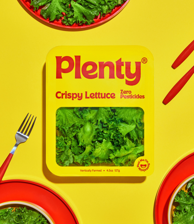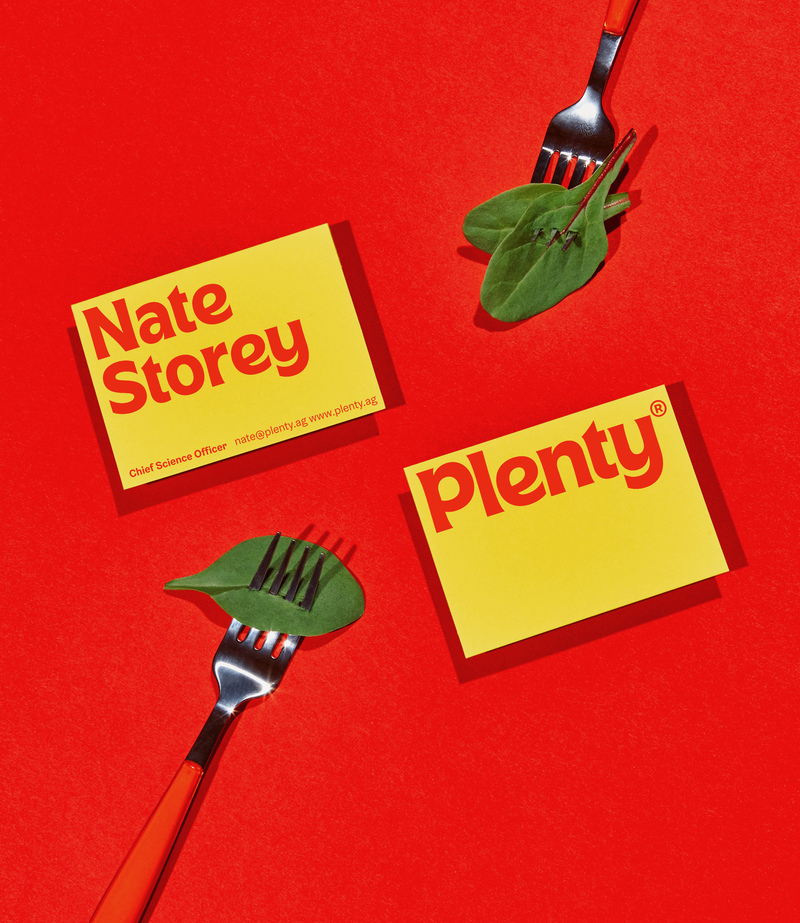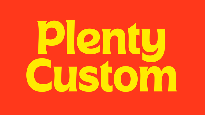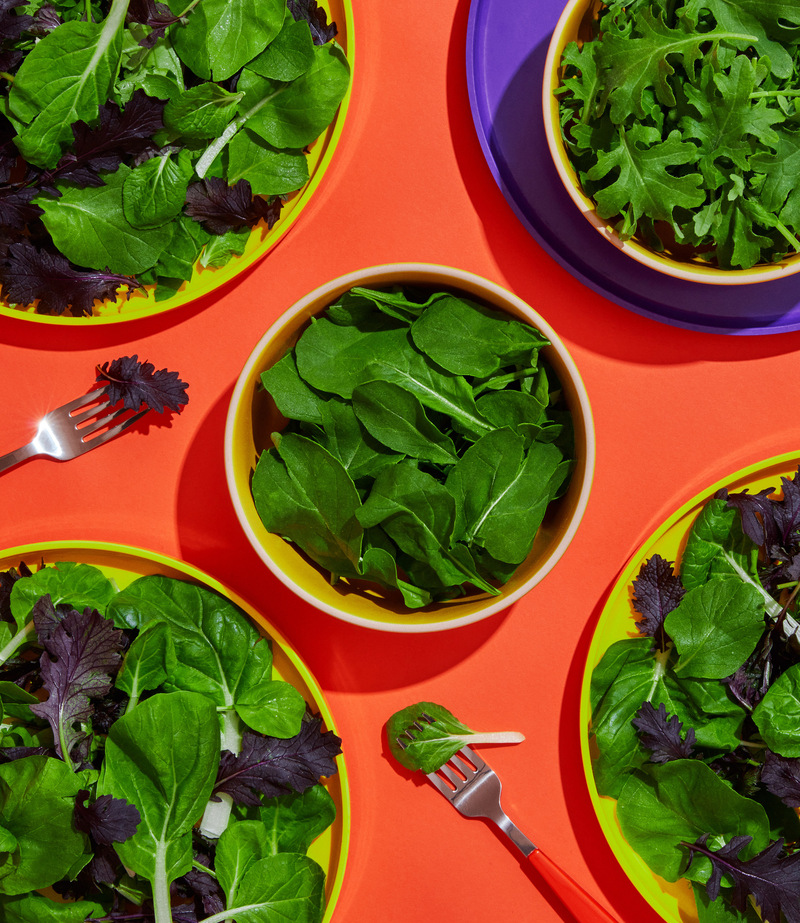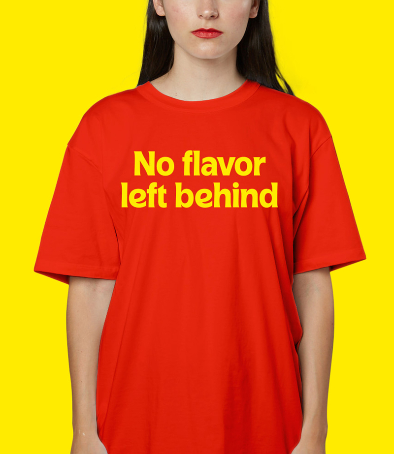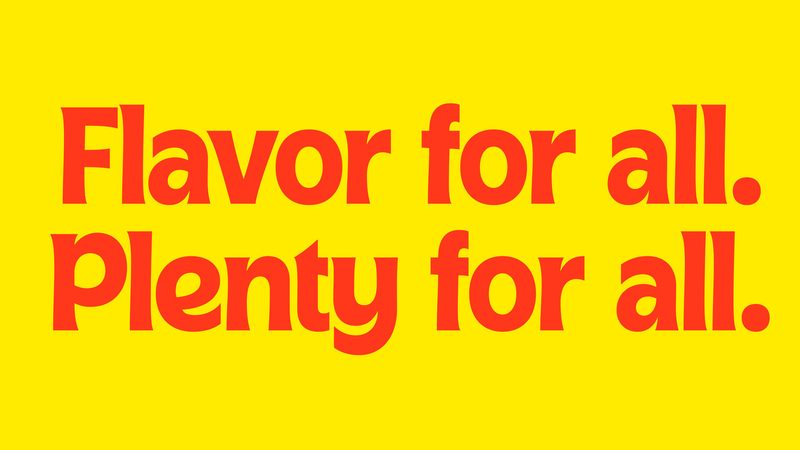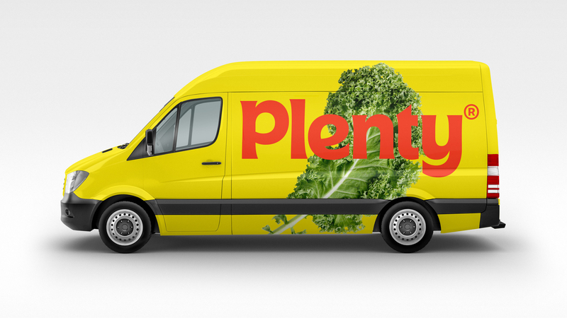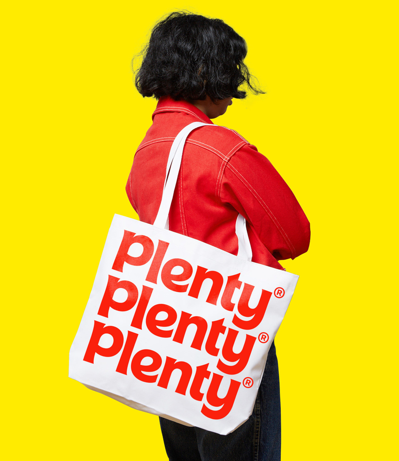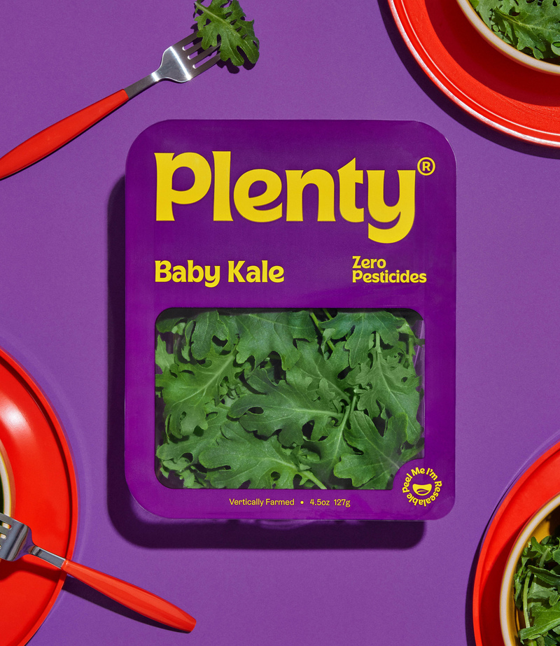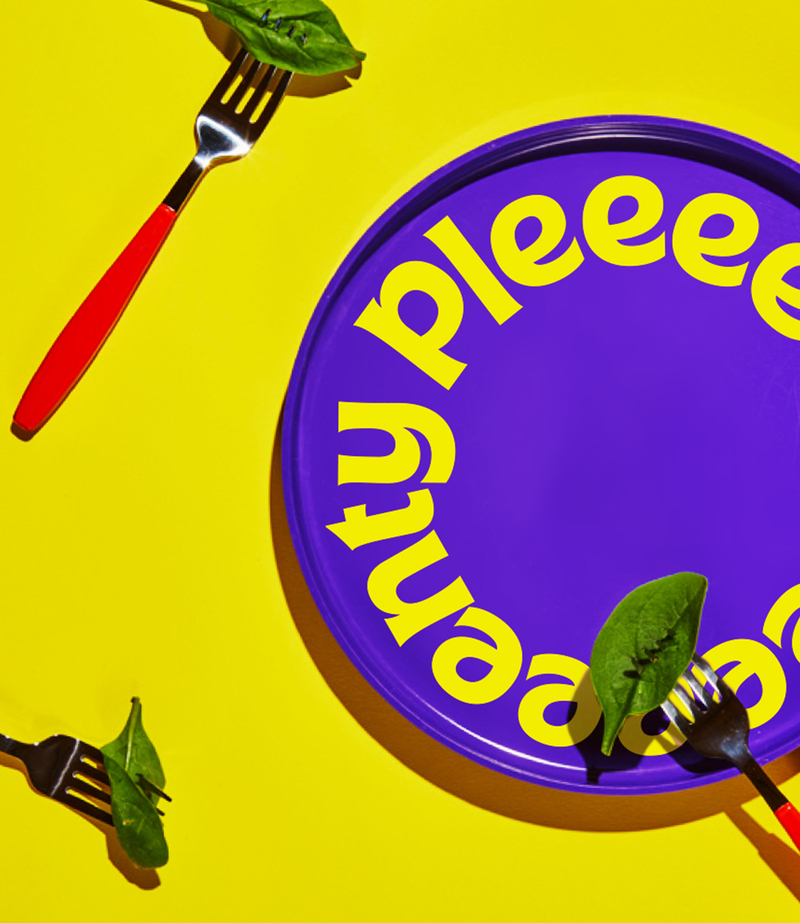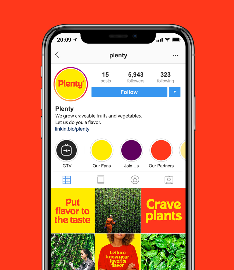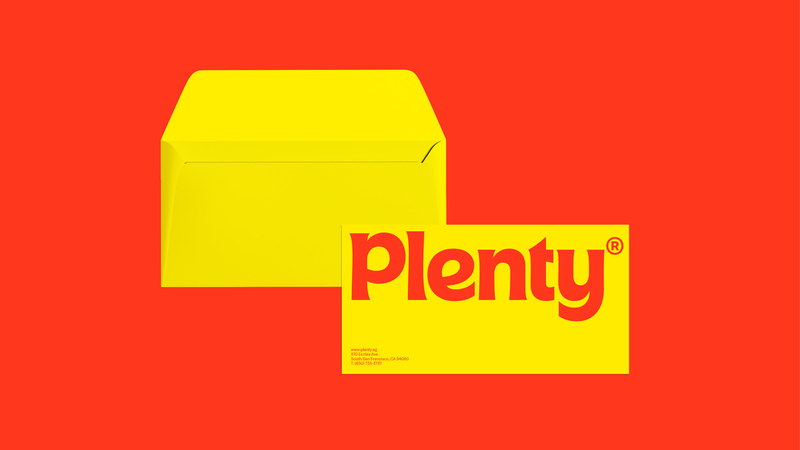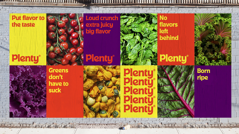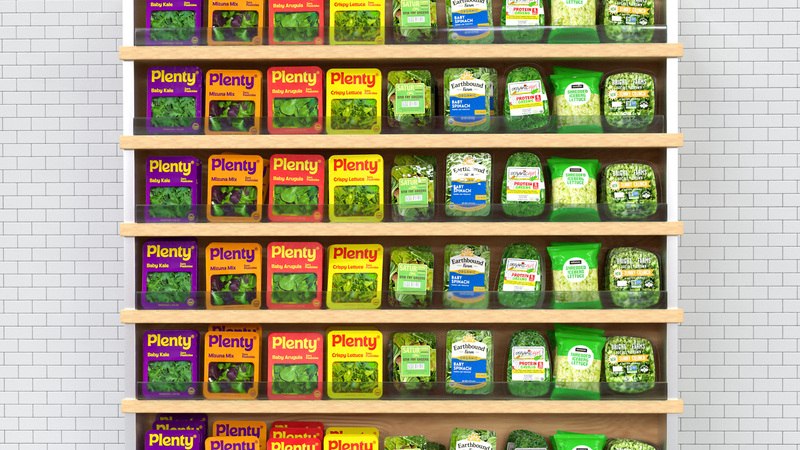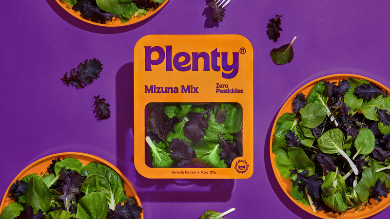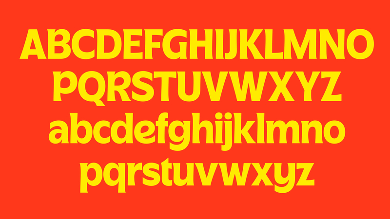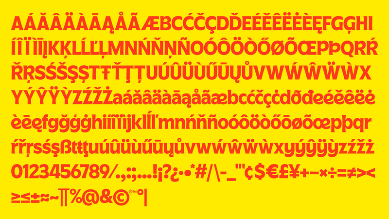

Plenty is an indoor vertical farming company that uses less space and fewer resources to grow flavorful produce. Imagine fruits and veggies replacing chips and soda. They came to us for a rebrand with two goals. The first was to convey the uniquely craveable flavor of Plenty produce. The second was to create a warmer and more approachable brand that felt accessible to all. We used a playful color palette with a welcoming custom font that is intended to look and feel delicious. Rather than sticking to typical healthy green visual cues, we took inspiration from desirable food categories which reflects in both the identity and packaging work.
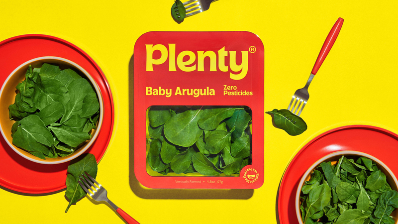
We wanted the packaging to look more like overtly flavorful food than leafy greens.
Client:
Brydon Gerus, Lenny Chase
Creative Direction:
Jessica Walsh
Strategy:
Lauren Walsh
Copywriting:
Stephanie Halovanic
Production:
Prue Linehan
Lead Designer:
Sanchit Sawaria, Rachel Denti
Design:
Sasyk Mihal, Laura Csocsán, Yijia Xie, Muhittin Güneş
Type Lead:
Sanchit Sawaria
Type Design:
Laura Csocsán, Alex Slobzheninov, Arthur Schwarz
Illustration:
Sanchit Sawaria, Sasyk Mihal
Photography:
Sarah Hopp
Retouching:
Daniel Plateado
Prop Design:
Arielle Casale